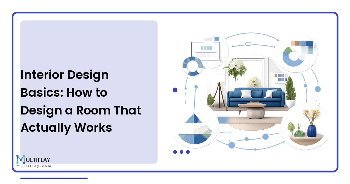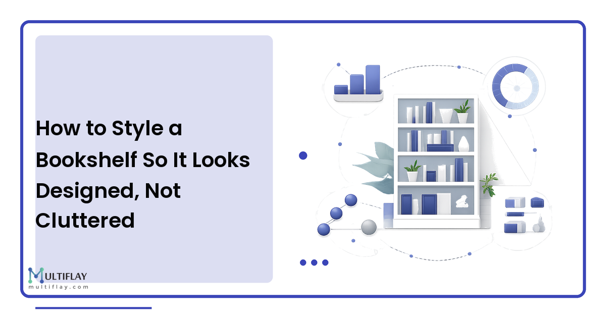
A bookshelf is the hardest thing in a room to get right, because it's the one piece of furniture you're asked to arrange rather than simply place. A sofa goes where it goes. A shelf is a blank grid you have to compose — and most of us fill it the way we empty a moving box: books jammed in spine-out, a few frames wedged into the gaps, every inch used. The result reads as clutter even when every object on it is something you love.
The takeaway up front: a styled bookshelf follows a method, not luck. Designers reach for the same small set of moves every time — balance three ingredients (books, objects, and empty space), alternate the rhythm of upright rows against flat stacks, vary the height so your eye travels, and edit until each shelf can breathe. None of it requires buying anything new — it's a rearranging job you can do in an afternoon.
Empty it completely before you style anything
You cannot style around clutter, so don't try. Take everything off the shelves and put it on the floor. Starting from an empty grid is the biggest reason a professionally styled shelf looks different from a lived-in one — the pro composed onto blank shelves; you accreted onto full ones.
As you unload, sort into three piles: books, objects (frames, ceramics, plants, sculptural things), and doesn't belong here (the remote, the charger, the mail). Be honest with that third pile — a shelf becomes a dumping ground precisely because it's at arm's height, and half of styling well is just removing what drifted in. Then group your objects loosely by material so you can see your palette before placing.
The designer formula: books, objects, and negative space
Every well-styled shelf balances three ingredients, and the one people forget is the third.
- Books are your bulk and backbone — roughly 60 to 70 percent of the shelf. They bring color, mass, and rhythm.
- Objects are the punctuation — the other 30-ish percent. A ceramic vessel, a small plant, a framed photo, a sculptural bowl. They break up the wall of spines and make it personal.
- Negative space — deliberate emptiness — separates "curated" from "crammed." A shelf packed corner to corner has nowhere for the eye to rest, so even beautiful things blur into visual noise.
Treat that 70/30 split as a starting point, not a law. The principle underneath it is the same sense of balance, scale, and breathing room that governs a whole room — the interior design fundamentals at a smaller scale. If a shelf feels off, the fix is almost always remove something, not add.
Arrange your books two ways, then alternate
Here is the move that instantly makes shelves look considered: stop standing every book upright. Use two orientations and alternate them.
- Vertical rows are the traditional upright line of spines. Keep them, but don't let them run wall-to-wall on every shelf or the unit reads like a library return cart.
- Horizontal stacks are books laid flat in a short pile. They do two jobs: they give the eye a calm rest between busy rows, and — crucially — a stack of three or four flat books becomes a pedestal. Set a small object on top and you've added height and importance to something that would otherwise vanish.
Alternating uprights and stacks creates rhythm, the quiet quality that makes a shelf feel designed. A reliable pattern per shelf: one vertical row held with a bookend, one horizontal stack topped with an object, and a gap between them. Vary which side the stack lands on shelf to shelf so the arrangement zig-zags rather than forming a rigid column.
Work in triangles and vary the height
Objects placed at random end up either evenly spaced (a store display) or clumped in one corner (a spill). The cure is the triangle: arrange items so their tops form a rough triangle — one tall, one medium, one low — so the eye moves up and down instead of scanning a flat line.
Two rules make this automatic:
- Group in odd numbers. Threes read as more natural and dynamic than pairs; a trio of a tall vase, a medium book stack, and a low bowl composes almost by itself. Pairs feel matched and static.
- Never line everything to the same top edge. Uniform height is what makes a shelf look like inventory. Let a tall vase break the plane while a stubby candle sits low beside it — contrast in height is what the eye reads as intentional.
Apply the triangle to the whole unit too — scatter your tallest items so they don't cluster on one shelf.
Choose objects that earn their place
The object layer is where a shelf becomes yours, but it's also where clutter creeps back in. A few principles keep it curated:
- Mix materials and finishes. Combine something organic (a plant, a dried branch), something crafted (a ceramic or wooden bowl), something reflective (glass or brass), and something personal (a framed photo). Variety of texture makes a small collection feel rich rather than repetitive.
- Go bigger, and fewer. One object with real presence beats five tiny trinkets, which just read as more clutter to dust. When in doubt, size up and cut the count. A single plant or a stem in a vase is the exception worth adding — it softens the hard edges and keeps a shelf from feeling like a museum case.
- Skip the matching set. Two identical vases flanking a shelf look staged; the same two at different heights on different shelves look collected.
Layer front-to-back and use the wall behind
Most shelves fail because they're styled as a flat grid, everything pushed to the front edge. Depth makes a shelf look professional, and it's free.
Lean, don't hang. Prop a small framed print against the back of a shelf and set a shorter object slightly in front of it. That overlap creates layers, and layers create depth — a piece of framed art leaning behind a low stack of books is the most reliable "designer" move there is.
Mind the color. A restrained palette unifies a busy shelf — pick two or three colors or materials and let them recur across the unit. Organizing books by color (the "rainbow shelf") calms visual chaos, but be honest about the trade-off: you lose the ability to find a title from memory, so it suits a display shelf more than a working library.
A quick bookshelf styling checklist
Run this pass before you call it done:
- [ ] Emptied the shelf completely and removed what doesn't belong?
- [ ] Books roughly 60-70% of the shelf, objects the rest?
- [ ] Deliberate empty space on every shelf?
- [ ] Alternated upright rows with flat, horizontal stacks?
- [ ] Objects grouped in odd numbers, mostly threes?
- [ ] Heights varied — nothing lined up to a single top edge?
- [ ] Materials mixed: organic, crafted, reflective, personal?
- [ ] At least one leaning piece for front-to-back depth?
FAQ
How do I style a bookshelf without it looking cluttered?
Clutter is almost always a negative-space problem, not a taste one. Empty the shelf and rebuild it leaving deliberate gaps so the eye can rest. Favor fewer, larger objects over many trinkets, keep books to about two-thirds of the space, and when a shelf feels busy, remove something rather than rearrange it.
What is the rule of thirds for shelf styling?
It's shorthand for two habits: a rough 70/30 ratio of books to decorative objects, and arranging items so their tops form a triangle — one tall, one medium, one low — grouped in odd numbers, usually threes. Triangles and odd groupings read as more natural than evenly spaced pairs, which look staged.
Should I organize books by color or by size?
Either works; pick by how you use the shelf. Organizing by color looks striking and calms a busy shelf, but you sacrifice finding a title from memory, so it suits display shelves more than a working library. Sorting by size or subject keeps books findable — a safe default.
How many objects should go on each shelf?
As a rule of thumb, one to three objects per shelf beyond the books — enough to add personality without competing. Group them in odd numbers and vary their heights into a small triangle. If a shelf feels busy, remove an object rather than adding a bigger one; a single piece with presence beats a cluster of small ones.
How do I style a bookshelf that's mostly a working library?
Lean into the books instead of fighting them. Break the wall of spines with horizontal stacks every shelf or two — they create rest and double as pedestals for objects. Slot small objects in at the ends of rows rather than clearing whole shelves for decor. Even a book-heavy unit looks intentional once you vary orientation.
Do I have to turn my books backwards to make a shelf look good?
No. Turning books spine-in creates a soft, neutral block some people love, but it makes every title unfindable — so reserve it for purely decorative shelves, never the books you use. If loud, mismatched spines are the problem, a few paper covers or grouping the busiest titles into one horizontal stack is a gentler fix.
Next step
Styling a bookshelf is a skill, not a talent — the same handful of moves works every time. Tonight, pick one shelf, empty it, and rebuild it with a single rule: alternate an upright row of books with a flat stack topped by one object, and leave a gap. Once you feel the difference rhythm and empty space make, work your way up the unit. For more practical, vendor-neutral guidance on styling and designing spaces you love, visit multiflay.com.